NAMHONG
Namkhong is a laotian beer brand that set out to reposition themselves in the market. Seeking to capture the hearts of young urban consumers, the brand aimed to evolve from being seen as simply affordable into a modern mainstream beer.
With the category leader dominating the market with yellow packs, Namkhong also had opportunity to strengthen their visibility on shelf.
Client
Heineken
Region
Laos
Scope
Pack Design
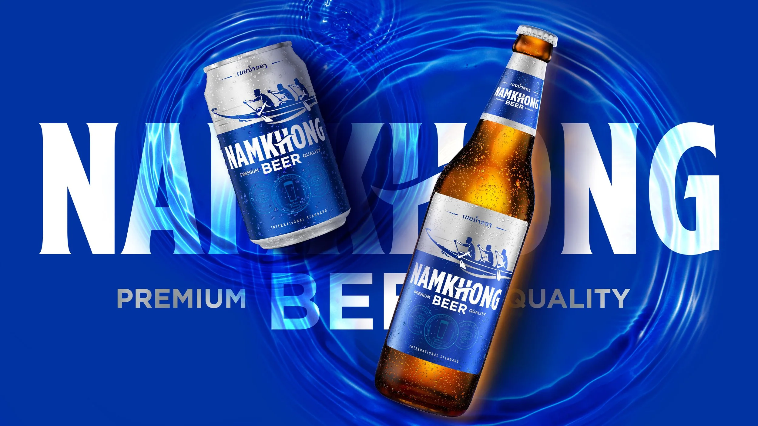
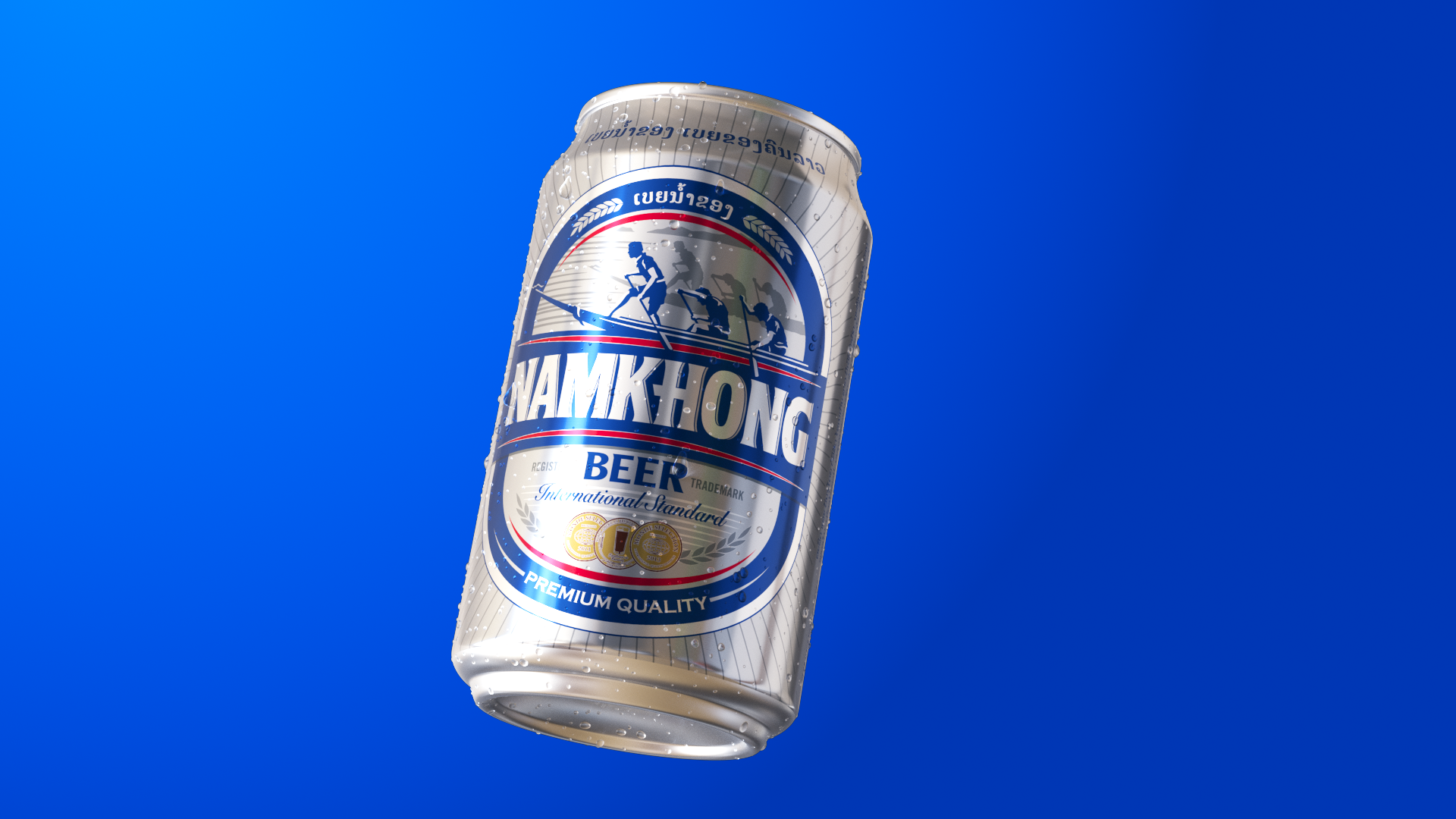
The strategic vision was to transform Namkhong from passive and generic to confident and iconic, while honoring its heritage. Namkhong’sbrand story, inspired by the Mekong river, sparked the creative approach to evolve the entire pack into a powerful scenery
of the river. The brand colour was strategically amplified into an unmissable bold blue. Guided by the brand’s ethos of progressing in life
in a “sabai sabai” way, the brand icon was reimagined from a competitive boat race into a joyful scene of rowing forward in life together.
The logotype was refined with a contemporary spirit, while the flowing wave woven into the letter “H” became a mark of Namkhong’s progressive nature. The result is a familiar brand reimagined into a bold and distinctive presence that stands out on shelf.